Remix Project
Preview

This tutorial explains how to use dynamic viewport units (svh, lvh, dvh) and relative units (vh, vw, vmax, vmin, em, rem) inside Framer projects. These units are useful when designing responsive layouts that adapt to changes in browser or device viewports, especially on mobile.
Currently, Framer doesn't natively support these dynamic sizing options. However, in this guide, I will show you a workaround to implement them in your projects.
You can track the progress of these features by following the Dynamic Viewports and Additional Sizing Options feature requests.
Why Dynamic Viewport Matters
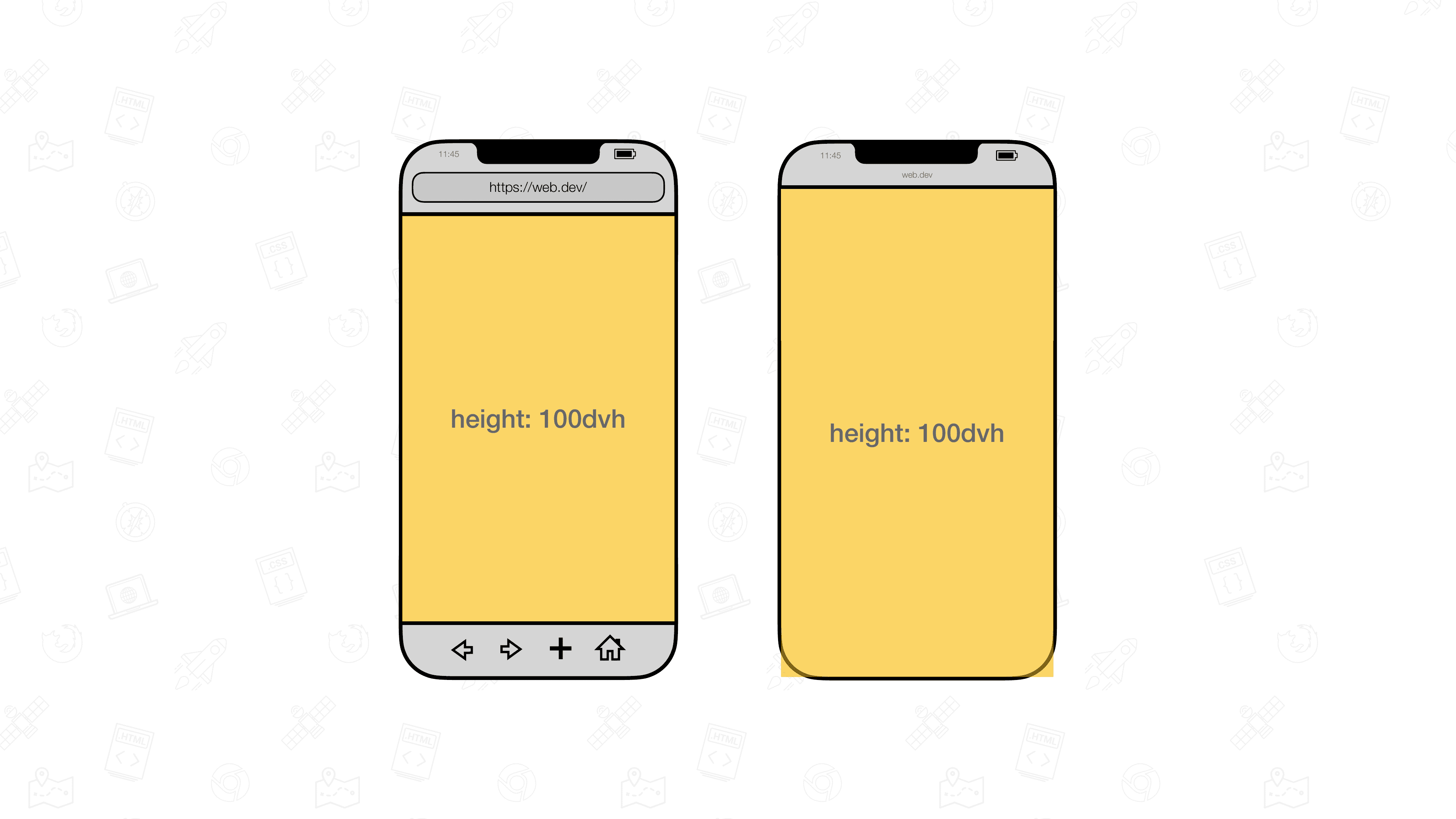
On mobile devices, the visible screen area changes when browser toolbars appear or disappear. Standard viewport units like vh do not adjust dynamically, which can make elements too tall or cut off when toolbars show up.
Dynamic viewport units fix this problem by adjusting based on the actual visible space:
lv*: Large viewport, assuming toolbars are retractedsv*: Small viewport, assuming toolbars are visibledv*: Dynamic viewport, automatically adjusts as toolbars appear or disappear
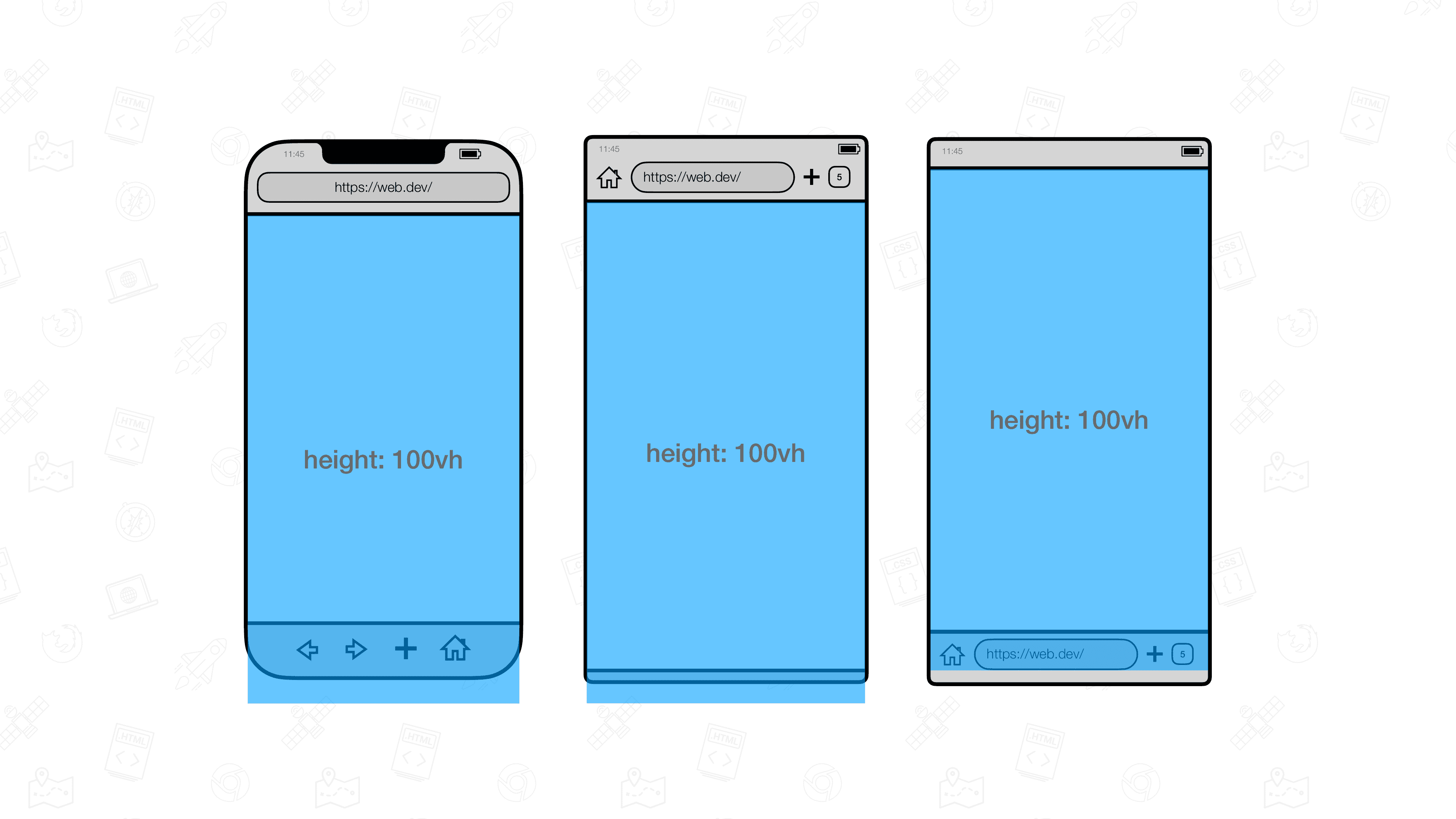
For example, if you set an element’s height to 100vh, it might extend beyond the visible area when toolbars are open. But 100dvh automatically resizes to fit, keeping your layout consistent on all devices.
You can learn more about these units on web.dev.
Step 1: Add the Code Override
Since Framer does not yet support these units natively, we will use a code override to make them work.
Open the remix link associated with this tutorial.
In your Framer project, create a new custom code override file named
DynamicAndRelativeUnits.tsx.Copy the code from the remixed project into your
DynamicAndRelativeUnits.tsxfile.
The override includes a function called withDynamicAndRelativeUnits that you can apply to any element that needs custom sizing.
Step 2: Apply the Code Override
After creating the override, apply the function to the element you want to size with dynamic or relative units.
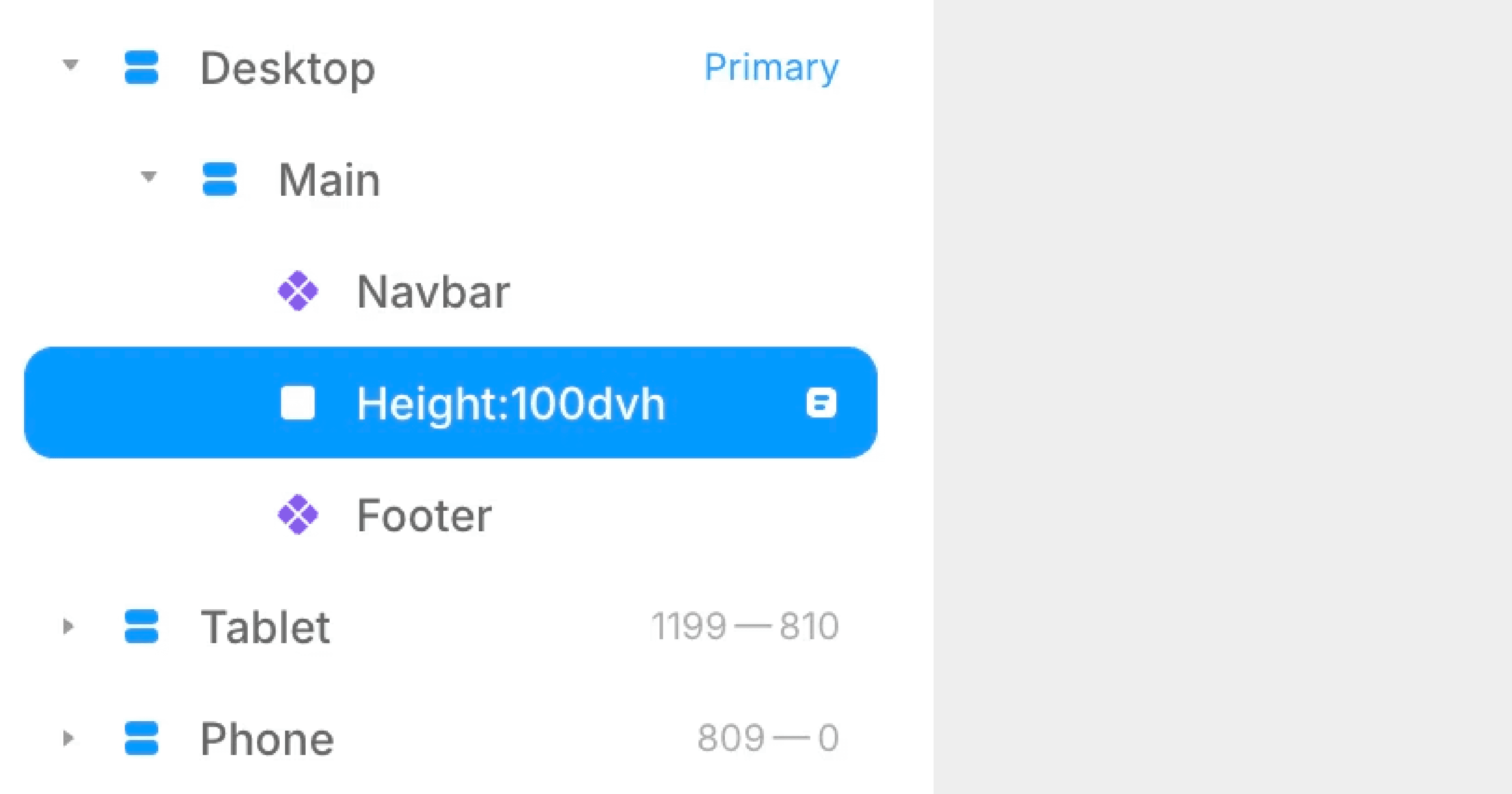
Rename the element according to this format:
For height only:
height:[value][unit]For width only:
width:[value][unit]For both height and width:
height:[value][unit]|width:[value][unit]
Examples:
height:100dvhsets the element height to 100 dynamic viewport height units.width:50remsets the element width to 50 relative units based on the root font size.height:100dvh|width:50vwsets both height and width at once.

Step 3: Preview and Adjust
Once applied, preview your page to see the new sizing in action. You can use any of the following units with this method:
Dynamic viewport units: dvh, dvw, dvmin, dvmax
Small viewport units: svh, svw, svmin, svmax
Large viewport units: lvh, lvw, lvmin, lvmax
Relative units: rem, em
The Result
Your layout will now automatically respond to dynamic viewport changes, making it more reliable across devices. You can combine these units for greater flexibility in responsive designs, ensuring consistent sizing without manually adjusting for toolbar behavior.
Don't forget to share this post!